
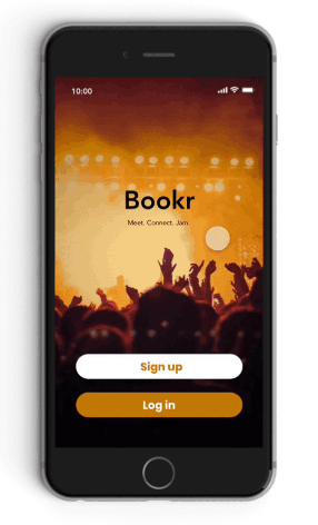
Bookr
Overview
My Role: UXR, UXD
Timeline: Fall 2018
Tools: Interviews, Survey, Competitive Analysis, Balsalmiq, Adobe XD, Usability Testing, Affinity Mapping, Sketching, Team Brainstorming
Team: Matt Golino, Cody O’Donnell, Isabel Newsome
At the start of this project, we set out to make something that would help musicians become more successful and productive. Initial research showed that the biggest pain point for musicians is finding “gigs” or opportunities. After further research, we created three different designs to meet the needs of our users and of those three, the most promising and the focus of our work was Bookr. Bookr is a mobile app that musicians and venues can use to find each other and schedule gigs.
Information Gathering
Interviews
Justification:
Objective:
We aren’t musicians. Because we aren’t musicians we can’t safely say we understand the problems musicians face. Rather than use a survey, we opted for semi structured interviews where we could ask a few questions but also leave it open enough for the musicians to express their ideas in their own way.
Understand the major pain points that musicians face so that we could narrow down our problem statement and scope.
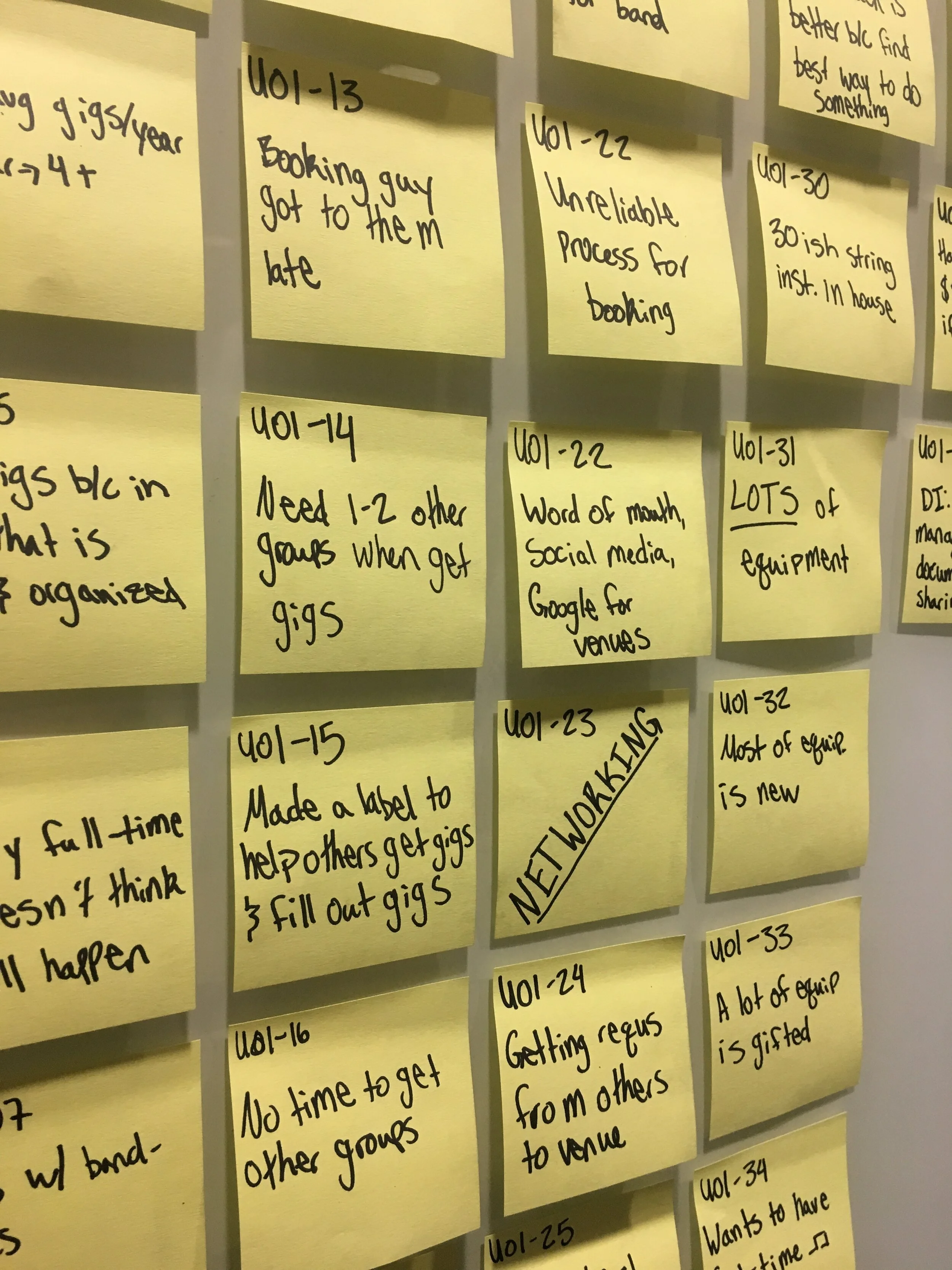
Some of the Post-It Notes from our analysis of our interview data
Method Details:
The process included two phone interviews and one in person interview
Participant’s backgrounds varied greatly in both genre and experience
Semi-Structured Interview format
Analyzed data using affinity mapping
Findings:
From our interviews we found a few different important pieces of information:
Booking gigs is one of the most difficult parts of being a musician
There are so many different avenues for finding gigs, musicians sometimes feel overwhelmed
One of the hardest aspects of the gig-booking process is communication with venues
Coordinating a schedule between a musician and a venue can be tedious
A critical step in finding a gig is networking
Payment methods vary from venue to venue
Based on the information we gathered through our interviews, we updated our problem statement…
Our updated Problem Statement:
How can we help amateur musicians find opportunities and foster better communication with venues?
Continuing Research
Survey
Justification:
Objective:
We used a survey so that we could quickly get a large amount of feedback. From our interviews, we had an idea of what we needed to ask and the kinds of responses that our users might give. This allowed us to create questions that would give us actionable data.
Now that we knew we wanted to look at helping musicians find gigs, we wanted to know more specifically what their pain points were through this process. We also wanted to know what kinds of things were important to them when looking for potential opportunities.

Responses to a ranking question asking about what attributes of a venue are most important when booking gigs
Method Details:
We sent the survey out to any friends that we knew that were musicians as well as posted it on the musician subreddit, r/musicians
We got over 80 responses from all over the world
Our respondents represented a diverse range of styles (classical, rock, jazz, etc.)
Questions included a variety of multiple choice, ranking, and fill in the blank
When analyzing our data we were able to filter responses based on varying factors such as a musician’s genre, how many gigs they played in an average month, and what their average audience size was. This allowed us to see patterns and trends.
Findings:
The musician’s genre and their average audience size have a high correlation with the issues they face in finding gigs and what is important to them in the process
The most important factor when looking for a gig is the potential profit for the musician
Technical proficiency and the vibe of a venue were both consistently ranked as very important to musicians
Most musicians already use phones to arrange gigs with venues
Finding opportunities was one of top 3 biggest difficulties when arranging a gig
A large network within the industry was often seen as an indicator of success
Competitive Analysis
Justification:
Objective:
By looking at what is currently being done, we can find out what works and what does not work for musicians. We can then use that information in our design to improve upon the existing solutions.
Understanding what solutions for this problem currently exist and why musicians may or may not like them is critical in developing a worthwhile solution.
Findings:
There aren’t many current products. Two of the main sites that we found were Gigtown and Sonicbids. Gigtown is designed to be a networking platform for musicians, venues and fans. Sonicbids is meant to be a band management tool. What we noticed about these and other sites was that the communication style and features were lacking or not inline with our user group. From our interviews we learned that musicians appreciated a more “grassroots” feel whereas many of these sites had a much more corporate style.
Design
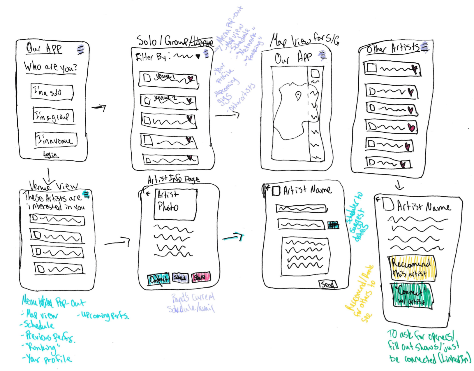
Phase I
Goal: Divergence, coming up with multiple different designs for our project space, rooted in research
Method:
Individual silent brainstorming
Come together as a group to discuss our ideas. We posted each idea around the room so they could be easily compared
Individually critique designs
Regroup to discuss the designs and possible improvements
Choose 3 to focus on and build out
Bookr
An app to easily connect musicians to venues

Gig Explorer
A desktop-based networking solution that provides in-depth information on musicians and venues

Tour Builder
A way for fans to interact with and suggest venues for musicians
Phase II
Goal: Convergence, decide on one design to pursue
the final decision was…
Bookr. This design was the most succinct and provided the best solution to our problem.
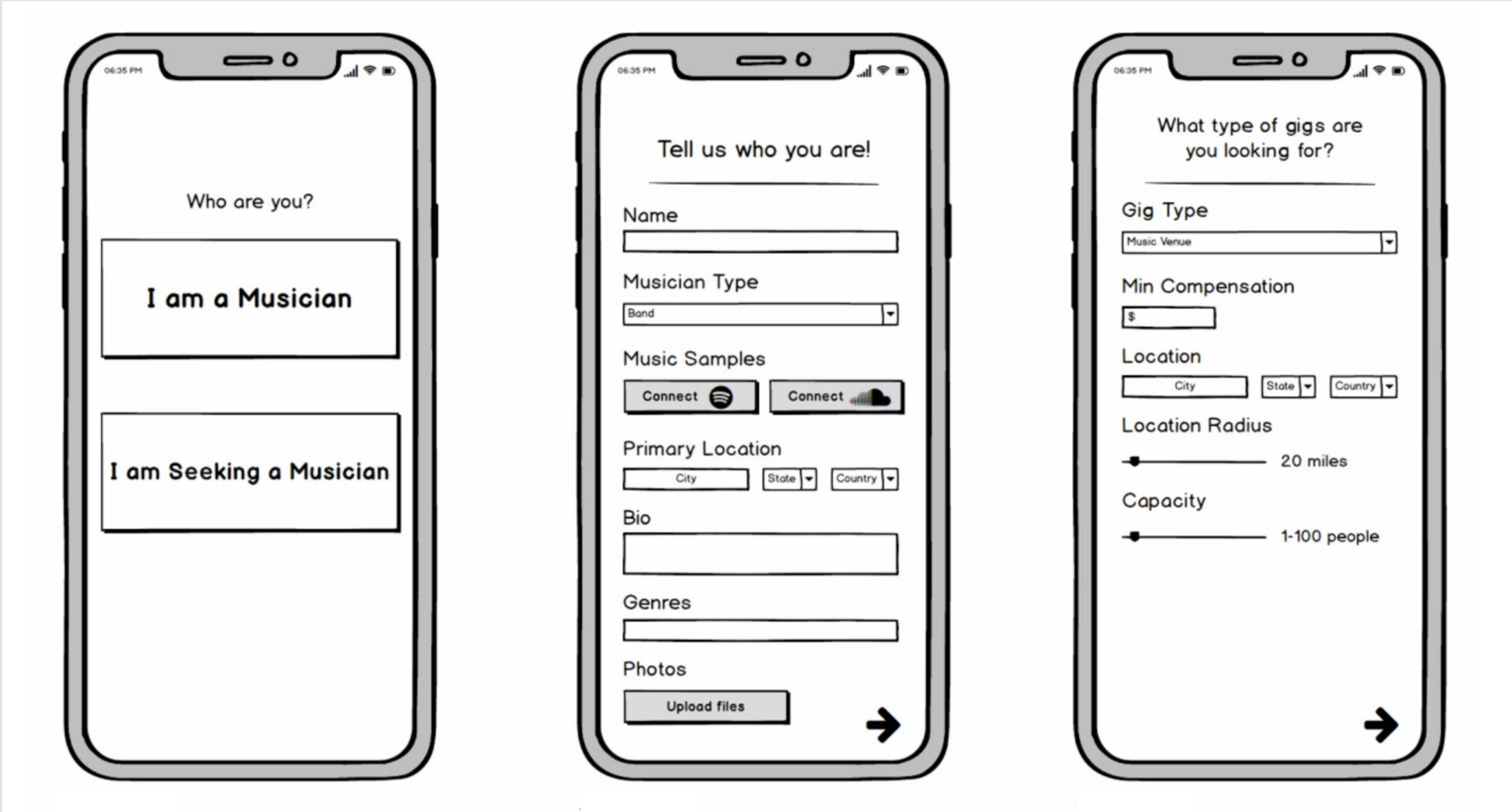
System Features:
Musician View
“Stack” of cards that users can swipe through, each with a potential gig
Each card has details of the gig such as date, type, and a short description
Users can swipe right if they want to express interest in a gig, or swipe left if they don’t
Initial questionnaire that sets personal gig requirements

Venue View
Ability to post gigs and define gig details
See “matches” according to date of gigs
Messaging view where users can see all matches for each posted gig and hear music samples
Chat where users can communicate with musicians they have matched with
Evaluation
Moderated Usability Testing
Justification:
Objective:
We used a task-based, moderated usability test so that we could review the entirety of the app from multiple perspectives. This method also allowed for the moderator to ask follow up questions if needed.
We wanted to get our prototype in the hands of users and get their feedback. Does our system effectively meet their needs?
Method Details:
5 users selected through convenience sampling
3 tasks, each putting the user in a different role of the system
Questionnaire given through Qualtrics
Think-Aloud Protocol
Recorded view of user interacting with screen and audio
Analysis of testing conducted using captured audio and video footage of both the user and the screen
Findings:
After reviewing the videos of each of our participants, our team found numerous design implications both specific and broad. Five of the most important of these are outlined below.

Users need tactile information to indicate when to proceed
Issue:
On some pages, such as the “All done!” page, there isn’t a button or easily identifiable indicator of how to proceed past this page. The way that a user would proceed is to press the check mark in the center of the page. However, this is not very clear and multiple users had issues with this.
Proposed Fix:
Create a “Next” button on this page (and others that have similar issues). This will foster consistency as the previous pages had a “Next” button as well as provide some indication for the user how to interact with the system in order to move forward.

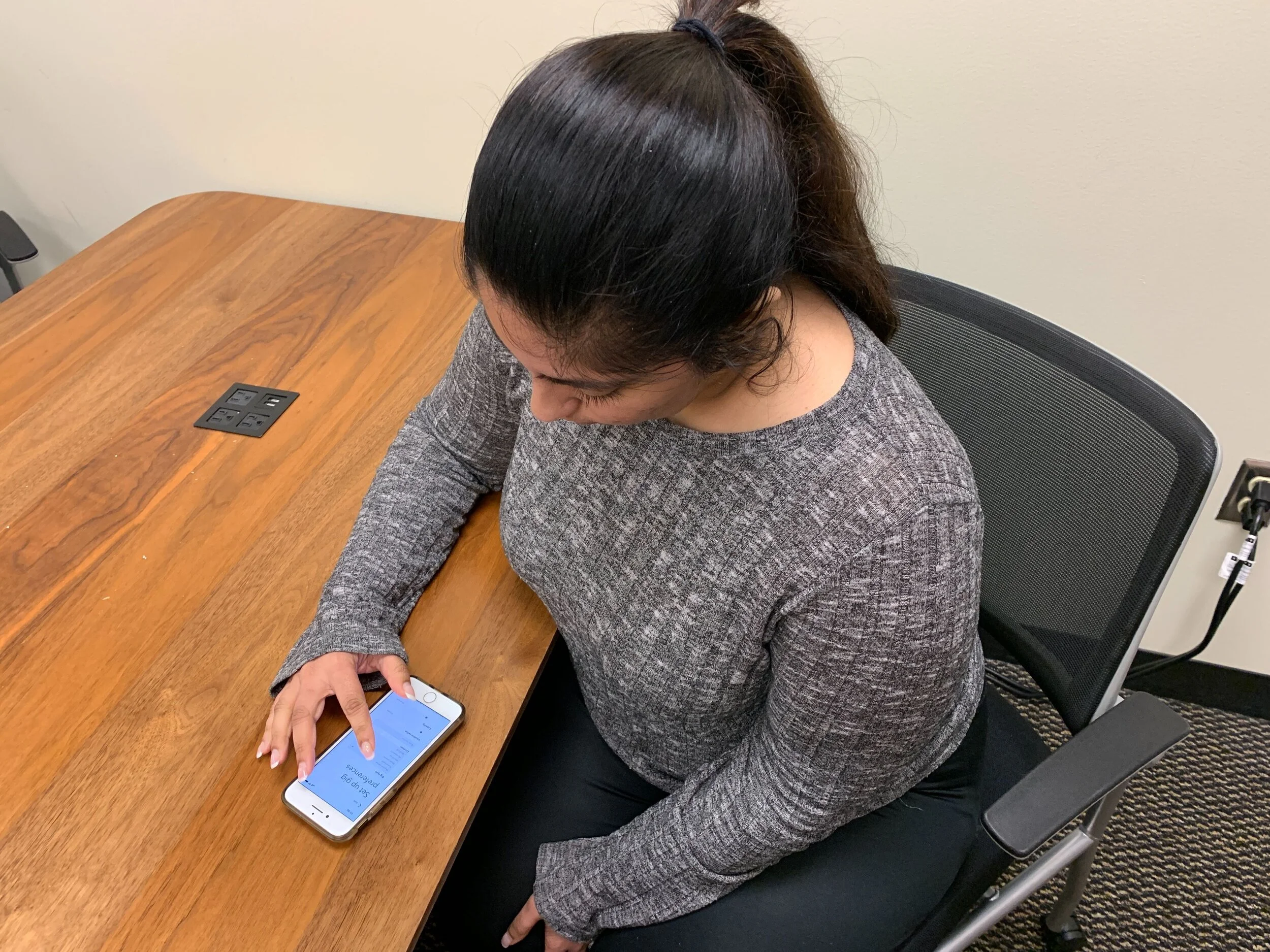
“Set up Gig Preferences” page needs more description
Issue:
When a musician enters our app, they are asked to set up a profile before they can see the “stack” of cards with potential gigs. When making this profile they are asked to answer some questions about what gigs they are looking for. Users were unsure what this page was about and what impact it would have on the application in the future. This is part of a larger problem that suggests the system should have a better onboarding process so that users understand what their actions are doing.
Proposed fix:
Provide a short description of what “gig preferences” means on this page. Additionally, provide a short onboarding experience such that the user understands the process and purpose of the application before getting to this page.

Clarify the “Save Preferences” option
Issue:
When a venue is creating a gig to post, there is a “Save Preferences as Defaults” option at the bottom of the page. This option was intended to counter the potential problem where venues want to post the same gig on multiple days. Rather than making them input the same information multiple times, we wanted to be able to save certain choices that would be defaulted the next time the user wanted to make a gig. However, when participants were asked to create a gig and save these preferences, they were unsure what the outcome of that option would be.
proposed fix:
When tackling this issue, there are a couple of different ways to solve it. One could be to simply add a description of the feature under the option that is currently on the page. Another could be that a small modal with a description appears the first time a user selects this option so that they know what it would do. The option could also be rephrased to be more clear, for example “Show me these settings next time”.

Distinguish between the “X” and “refresh” options in the card view
Issue:
In the “stack” of cards view, the musicians have three main buttons; the “X”, the “Refresh”, and the “Heart”. The initial purpose of the X was to indicate that the user was not interested in the opportunity while the refresh was intended to bring back the previous opportunity that the user selected X on. During our testing the participants were not sure what the refresh meant or how it differed from the X.
Proposed Fix:
The icon for the “refresh” action can be changed to something that might be more applicable to the situation, such as a recycle symbol. An explanation of this feature can be added in the onboarding that was discussed above. Finally, re-branding the button as “Return” may also provide clarity into its function.

Incorporate swiping function into card view
Issue:
Our prototype was created using Adobe XD. A user can interact with the prototype using the HotSpots that were setup in XD or by swiping through the screens. If the user swipes through the screens, they will only get to the next artboard which is not necessarily the next in the flow. Adding onto this, many of our participants had a mental model of a dating app in which you can swipe left or right on a card to either discard it or add it to your liked items. However, when they swiped on this prototype they would get the expanded version of the card (as if they had tapped “see more”) which was the next artboard. The system should follow the users mental models and if similar to another system, should be consistent in interaction style.
Proposed fix:
Adobe XD now has a feature that will allow a drag action to be the trigger for an interaction. By adding this drag interaction, we can keep with the mental model of the user. We will keep the current interaction of tapping the X or heart button as well.
Reflections
What I Learned:
It’s no exaggeration that musicians have struggled with finding venues to perform at for centuries. For the vast majority of the existence of this problem, nothing could be done about it. Thanks to modern technology and the pervasiveness of handheld mobile computers, we can start formulating solutions that have eluded us for ages. Bookr was such an exciting project to work on because we were able to take this age old problem and create a simple and concise solution. The project exemplified just how impactful designs can be and the vast benefits to conducting proper and thorough research into a subject and its connoisseurs. I hope my career will be filled with opportunities to learn more about a community and allow that to influence my research the way Bookr has been.
What’s Next?
Starting with what we discovered at the end of our project, I’d like to work on another iteration of the app and address the design implications discovered. Additionally, after creating designs, conducting interviews, and drawing conclusions, I’ve learned what methods work for me and some pitfalls to avoid. I hope to take those lessons learned and apply them to my next big project and continue to develop as a user experience researcher.