
Advanced Marketing Systems
Overview
My Role: UXR
Timeline: Summer 2019
Tools: Paper prototypes, InVision, Sketch, Empathy Maps, Personas, UserZoom
During my summer internship at NCR, I was able to work on a group project with three other UX interns on the team. The project we were given was to reskin and re-architect an outdated marketing and promotions platform called Logix. This system was created for marketing managers to create and organize marketing campaigns. This includes creating offers (e.g. buy two get one free) for their customers.
We were given 9 weeks to complete the project before presenting it at the company-wide Intern Expo. Because of the time constraints, we were not able to connect with users or stakeholders until after the design had been completed. We conducted testing with paper prototypes followed by an InVision prototype.
System Audit

The first step that the team took was to understand the system. As a result of a short timeline and limited access to Subject Matter Experts (SMEs), we had to learn this incredibly complicated system on our own. As a result, we ended up making a lot of assumptions that turned out to be incorrect, but more on that later.
We created a site map of the system (shown to the right) that outlined each section of the platform and what it included. While the product had many features, we focused our attention on the process of creating an offer. We felt that creating an offer was the main feature of the Logix platform and therefore chose to focus on it.
Creating The New Flow
Once we had a good idea of what the product did and how it worked, myself and one other intern sat down to design the interactions for the new flow. Working together on a whiteboard, we went through the process of creating a new offer.


Our new design was a wizard-type format. The wizard brought users through each required step of the offer making process sequentially, then gave them the option to edit anything else. We felt that after learning the hard way that some pieces of the offer were prerequisites for others, it would create a better user experience to only show users options that were available to them based on what they had already done.
For example, in order to add a reward to your offer, you first had to add a product condition. However, in order to add a product condition you had to have first added a customer condition. In the existing system, none of this was indicated and was only made clear once you made a customer condition, which enabled the product condition option. Thus, we felt that by “forcing” users to follow this order we could eliminate any frustrations caused by this confusion. The wizard proceeds as follows:
Basic info
Conditions
Customer Condition
Product Condition
Rewards
Product
Reward settings
Channels
Locations
Store Groups
Terminals
Review
Summary page
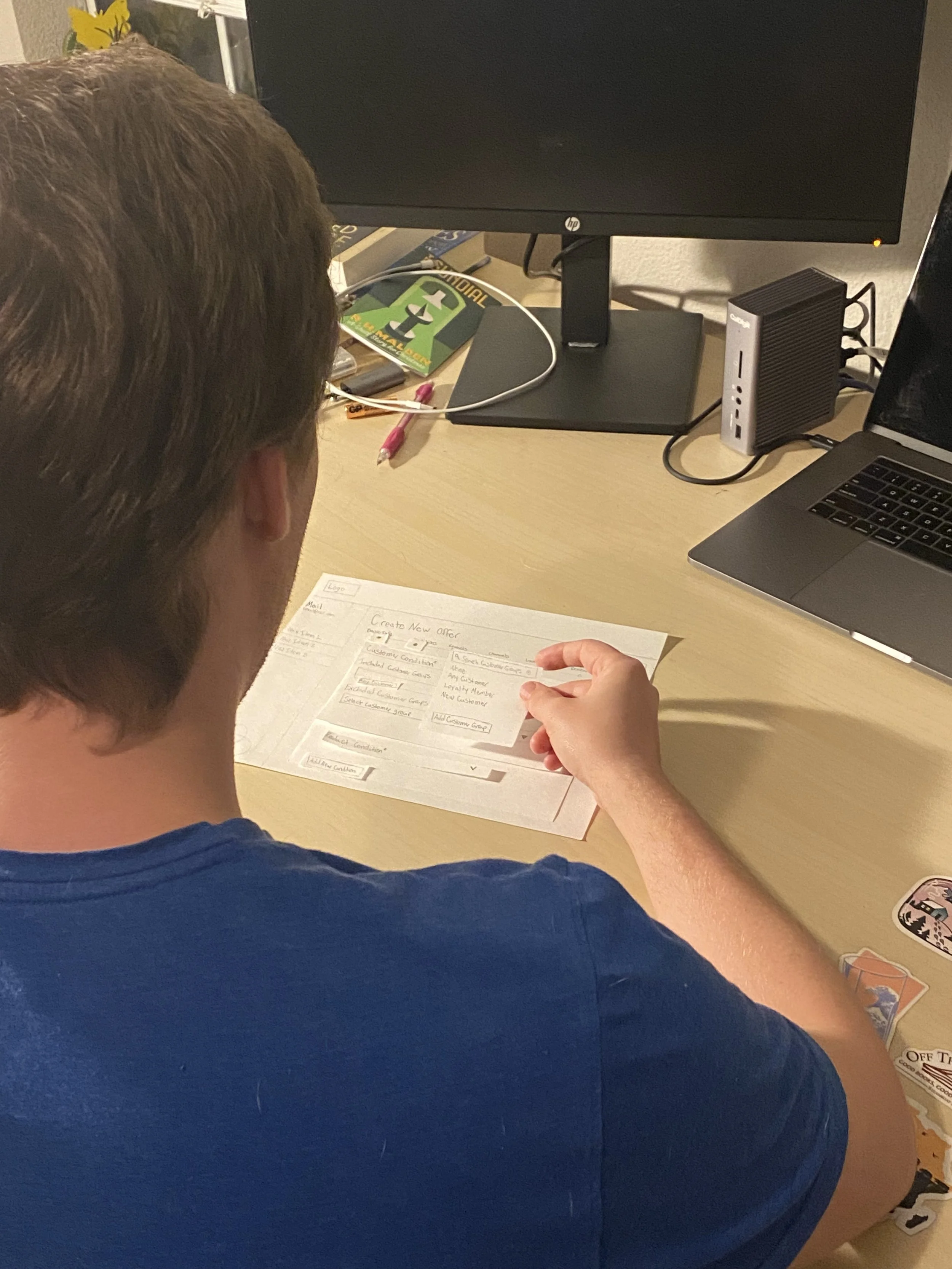
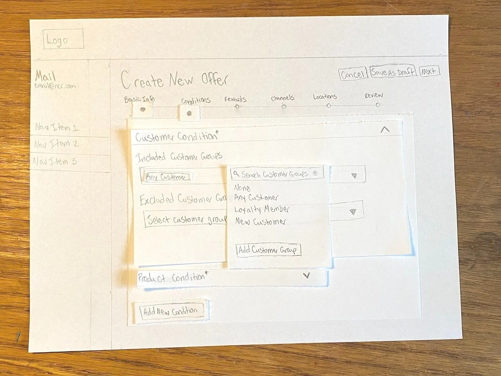
Testing it - Paper Prototype
Once we had landed on a flow for the wizard, we wanted to test it. We decided to create a paper prototype that could be used to quickly create and test with. In addition, we wanted to test our new wizard design against the existing design to better understand how they compare. As such, we recreated the existing design using paper so that when testing it against the paper prototype of the new design, participants were not swayed by the differing fidelity.
Participants:
10 novice participants
Sourced from the XD team members and other interns throughout the business
Study Design:
Participants were asked to create an offer with both the new design and the existing design. Which of the two designs was presented first was randomized for each participant in an effort to reduce learning effects. A within-subjects design (participants shown both designs) was chosen due to a lack of time and resources. Given an extended timeline, a between-subjects design (each participant only shown one design) would have been utilized to further decrease learning effects.
Participants were given specific details at each step of the offer creation process that would provide them with “what” to do while not telling them “how” to do it. For example, participants were asked to create a reward that gives customers 10% off of beverages when a burger is purchased. In order to create this offer, participants had to create a product condition for the burger purchase. When participants reached the product condition section of the test, they were prompted to create a condition for the burger purchase. More guidance than strictly necessary was provided because of the novice nature of participants.
Findings:
New design vastly outperformed the existing designs on ease of use scores and user feedback/preference
Participants were confused as to why they had to put a product in the Rewards section when you had already put it in the Product Condition section
If a reward requires a product to be purchased in order to activate, it must be added in the Product Condition section
If a reward offers a discount on a product, that product must be added in the Rewards section
Product Condition was renamed to Purchase Product Condition in an effort to alleviate this confusion
Summary page is where you are taken first after “creating” an offer in the existing design (giving it a name and engine), but it is a long page with a bunch of options and it is not clear what those options are
Testing it - Clickable Prototype
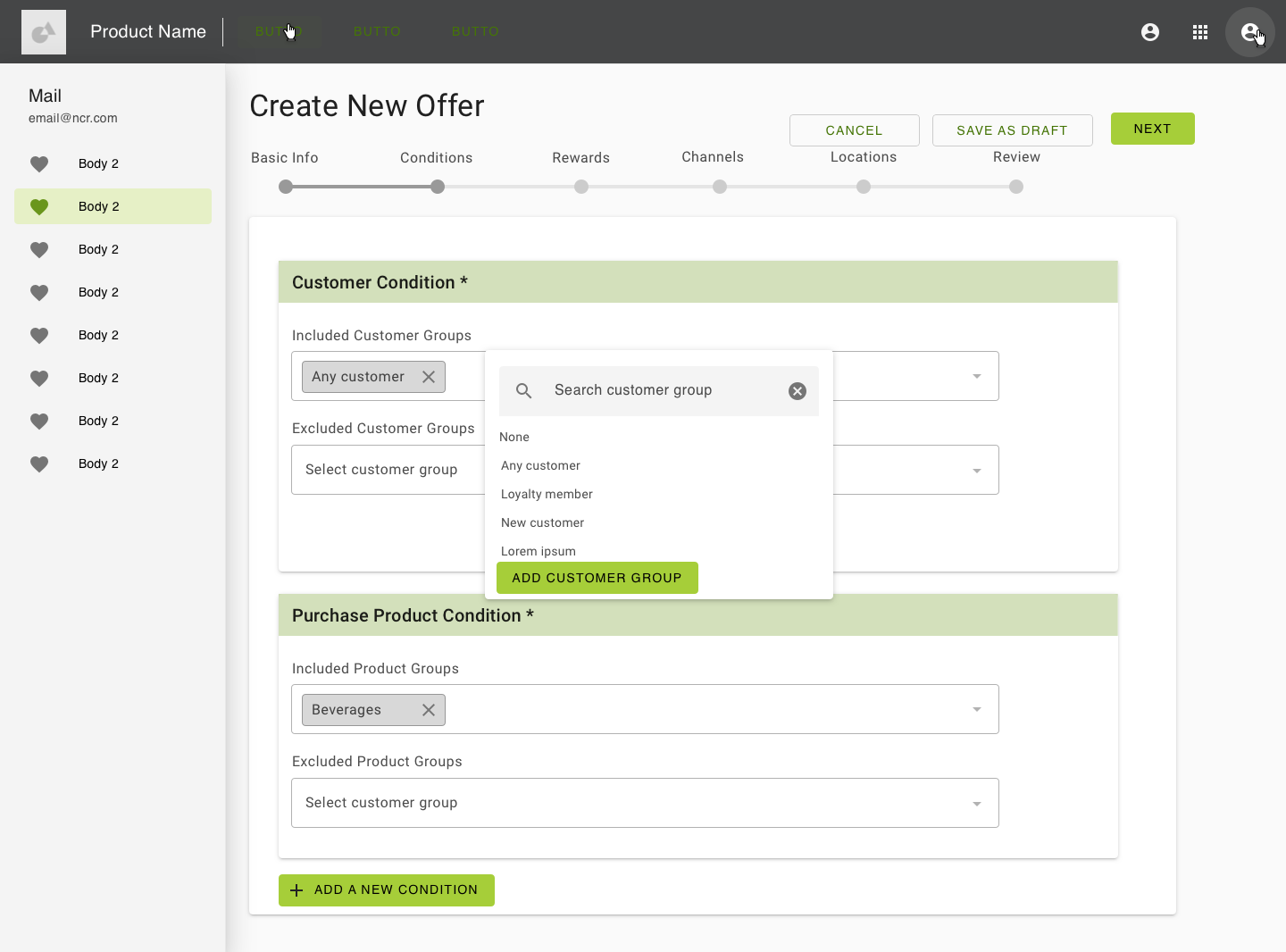
Example of New Wizard Flow
Study Design
Armed with the information gathered from the paper prototype study, the team created clickable prototypes using Sketch and InVision. Both new and old designs used the new NCR Design System. The old designs had to be reskinned prior to the study launching.
The same test as before was conducted using the clickable prototypes rather than the paper prototypes. The same participants were used to enable comparison between iterations. In addition, SMEs were sought out and shown just the new design. They were given free reign (with any questions answered) in the prototype as they were very familiar with the system. SMEs were internal employees who worked closely with the product.
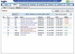
Example of Legacy System
Findings
When we presented the proposed designs to internal SMEs, they did not like the wizard aspect of it - this mostly seemed to be because they had used the old way for a long time and found their own workarounds that weren’t really fixes to a larger usability issue
Some of what we learned from SMEs was valuable information regarding assumptions we had made. We had grabbed what we thought was important from the initial summary page, but turns out there is a lot more that is important there, we just didn’t know what it was
The new designs still outperformed the existing ones on each metric with novices
Reflections
What I Learned:
It’s really important to be able to talk to SMEs and really understand the product that you are working on. We disregarded some features simply because we didn’t know what they were, and they turned out to be really important. Sometimes in a corporate environment, all that you can do to improve a legacy system is to re-skin it, and improve the visual design of the product. Working with a group, it is important to divide up the work and delegate jobs to those that it is best suited for. For example, I was in charge of planning and executing the two research studies that we conducted while the FED on the team executed the re-skinning using the design system she was helping to create.
I also learned that many times a project can be a balancing act between new and improved designs and taking into account the preferences of the people that have been using the old system for years. They will be the primary users of the new system and ensuring they are happy with the changes can be just as important as creating the best possible system.
What’s Next?
The loyalty platforms for both retail and hospitality are being brought together and created into a “Next-Gen Loyalty” platform for NCR based on our research and designs.